Let’s make a separate line plot for each continent, highlighting the top 6 countries.
We’ll also add points to only the top 6 countries.
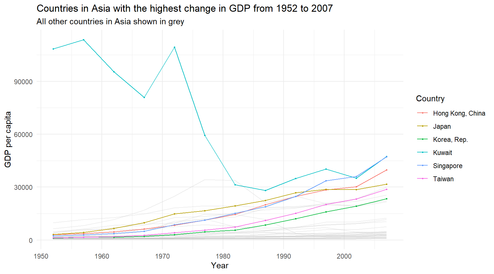
# Asiaggplot() +geom_line(data = g_asia,aes(x = year, y = gdpPercap, group = country),color ="grey",alpha = .3,linewidth = .5) +geom_point(data = gdp_asia,aes(x = year, y = gdpPercap, color = country),size = .5) +geom_line(data = gdp_asia,aes(x = year, y = gdpPercap, color = country)) +labs(title ="Countries in Asia with the highest change in GDP from 1952 to 2007",subtitle ="All other countries in Asia shown in grey",x ="Year",y ="GDP per capita",color ="Country") +theme_minimal()
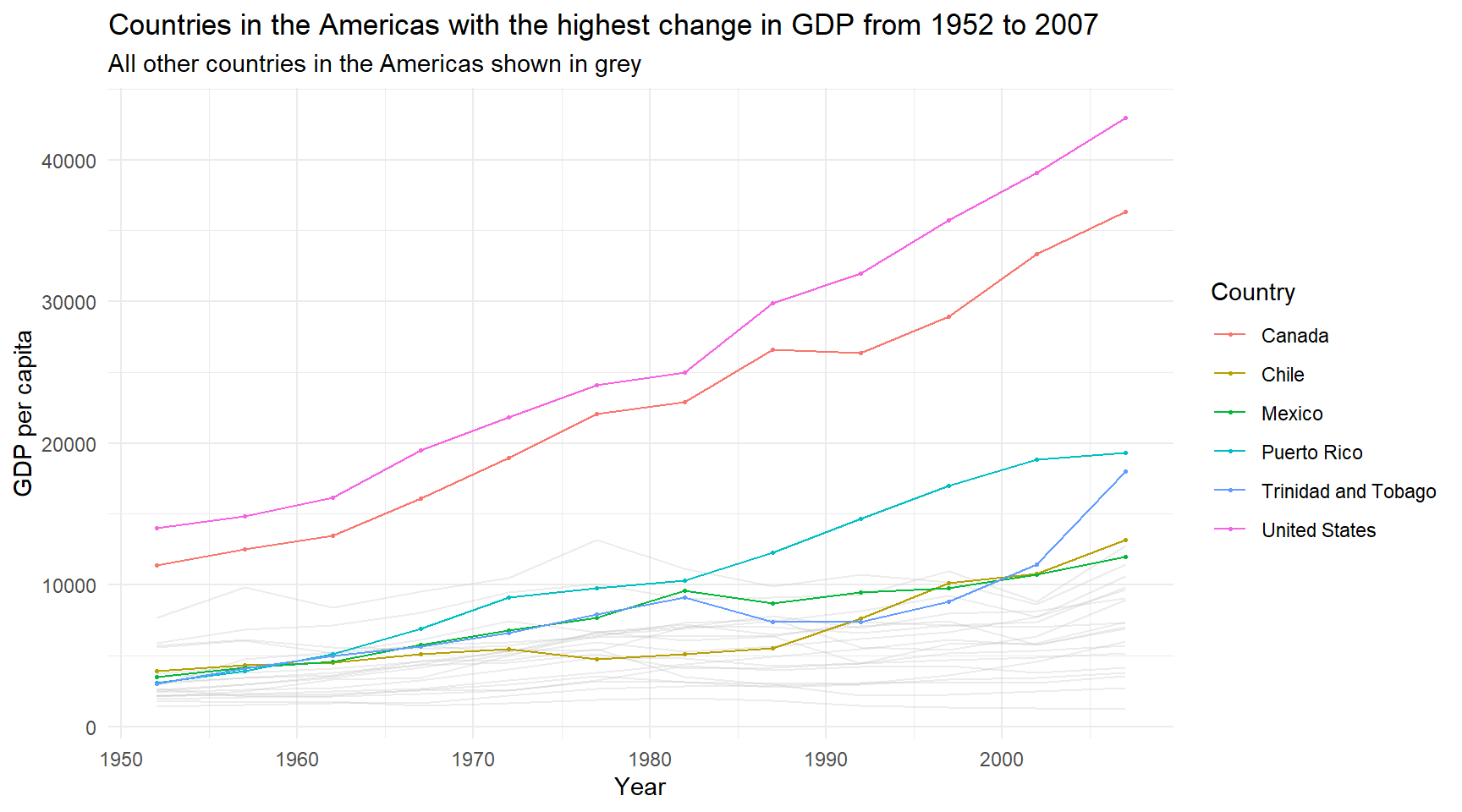
# Americasggplot() +geom_line(data = g_americas,aes(x = year, y = gdpPercap, group = country),color ="grey",alpha = .3,linewidth = .5) +geom_point(data = gdp_americas,aes(x = year, y = gdpPercap, color = country),size = .5) +geom_line(data = gdp_americas,aes(x = year, y = gdpPercap, color = country)) +labs(title ="Countries in the Americas with the highest change in GDP from 1952 to 2007",subtitle ="All other countries in the Americas shown in grey",x ="Year",y ="GDP per capita",color ="Country") +theme_minimal()
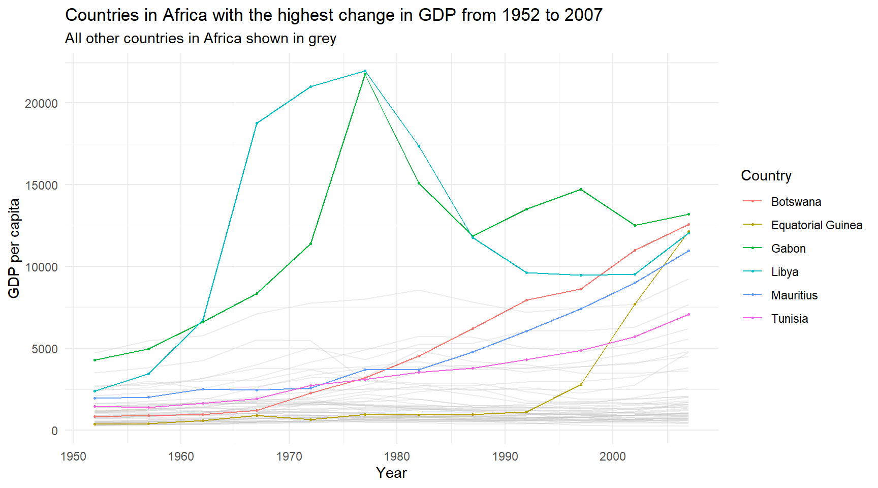
# Africaggplot() +geom_line(data = g_africa,aes(x = year, y = gdpPercap, group = country),color ="grey",alpha = .3,linewidth = .5) +geom_point(data = gdp_africa,aes(x = year, y = gdpPercap, color = country),size = .5) +geom_line(data = gdp_africa,aes(x = year, y = gdpPercap, color = country)) +labs(title ="Countries in Africa with the highest change in GDP from 1952 to 2007",subtitle ="All other countries in Africa shown in grey",x ="Year",y ="GDP per capita",color ="Country") +theme_minimal()
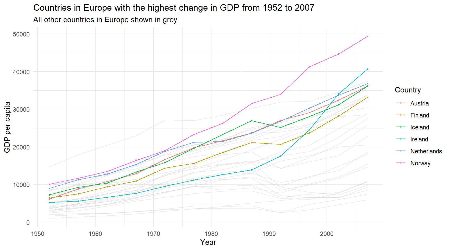
# Europeggplot() +geom_line(data = g_europe,aes(x = year, y = gdpPercap, group = country),color ="grey",alpha = .3,linewidth = .5) +geom_point(data = gdp_europe,aes(x = year, y = gdpPercap, color = country),size = .5) +geom_line(data = gdp_europe,aes(x = year, y = gdpPercap, color = country)) +labs(title ="Countries in Europe with the highest change in GDP from 1952 to 2007",subtitle ="All other countries in Europe shown in grey",x ="Year",y ="GDP per capita",color ="Country") +theme_minimal()
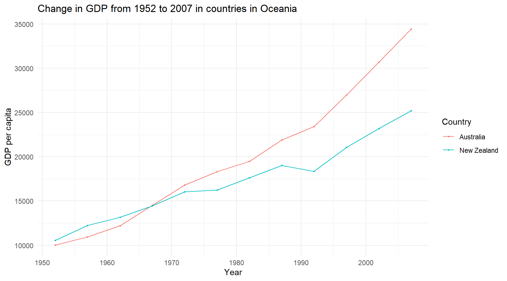
# Oceaniaggplot() +geom_line(data = g_oceania,aes(x = year, y = gdpPercap, group = country),color ="grey",alpha = .3,linewidth = .5) +geom_point(data = gdp_oceania,aes(x = year, y = gdpPercap, color = country),size = .5) +geom_line(data = gdp_oceania,aes(x = year, y = gdpPercap, color = country)) +labs(title ="Change in GDP from 1952 to 2007 in countries in Oceania",x ="Year",y ="GDP per capita",color ="Country") +theme_minimal()